# Copyright 2025 Google LLC
#
# Licensed under the Apache License, Version 2.0 (the "License");
# you may not use this file except in compliance with the License.
# You may obtain a copy of the License at
#
#     https://www.apache.org/licenses/LICENSE-2.0
#
# Unless required by applicable law or agreed to in writing, software
# distributed under the License is distributed on an "AS IS" BASIS,
# WITHOUT WARRANTIES OR CONDITIONS OF ANY KIND, either express or implied.
# See the License for the specific language governing permissions and
# limitations under the License.
BigQuery DataFrame Visualization Tutorials#
|
|
|
|
This notebook provides tutorials for all plotting methods that BigQuery DataFrame offers. You will visualize different datasets with histograms, line charts, area charts, bar charts, and scatter plots.
Before you begin#
Set up your project ID and region#
This step makes sure that you will access the target dataset with the correct auth profile.
PROJECT_ID = "bigframes-dev"  # @param {type:"string"}
REGION = "US"  # @param {type: "string"}
import bigframes.pandas as bpd

bpd.options.bigquery.project = PROJECT_ID
bpd.options.bigquery.location = REGION
You can also turn on the partial ordering mode for faster data processing.
bpd.options.bigquery.ordering_mode = 'partial'
Histogram#
You will use the penguins public dataset in this example. First, you take a look at the shape of this data:
penguins = bpd.read_gbq('bigquery-public-data.ml_datasets.penguins')
penguins.peek()
| species | island | culmen_length_mm | culmen_depth_mm | flipper_length_mm | body_mass_g | sex | |
|---|---|---|---|---|---|---|---|
| 0 | Adelie Penguin (Pygoscelis adeliae) | Dream | 36.6 | 18.4 | 184.0 | 3475.0 | FEMALE |
| 1 | Adelie Penguin (Pygoscelis adeliae) | Dream | 39.8 | 19.1 | 184.0 | 4650.0 | MALE |
| 2 | Adelie Penguin (Pygoscelis adeliae) | Dream | 40.9 | 18.9 | 184.0 | 3900.0 | MALE |
| 3 | Chinstrap penguin (Pygoscelis antarctica) | Dream | 46.5 | 17.9 | 192.0 | 3500.0 | FEMALE |
| 4 | Adelie Penguin (Pygoscelis adeliae) | Dream | 37.3 | 16.8 | 192.0 | 3000.0 | FEMALE |
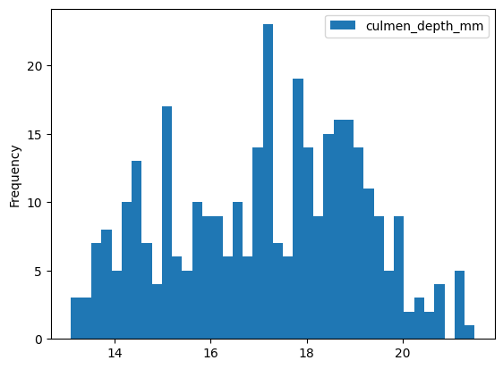
You want to draw a histogram about the distribution of culmen lengths:
penguins['culmen_depth_mm'].plot.hist(bins=40)
<Axes: ylabel='Frequency'>
Line Chart#
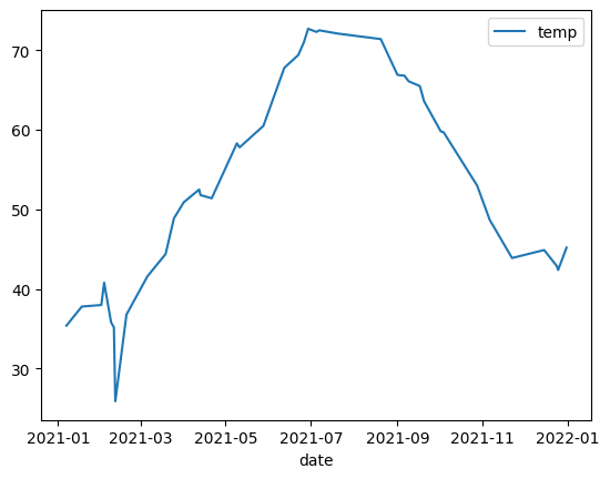
In this example you will use the NOAA public dataset.
noaa_surface = bpd.read_gbq("bigquery-public-data.noaa_gsod.gsod2021")
noaa_surface.peek()
| stn | wban | date | year | mo | da | temp | count_temp | dewp | count_dewp | ... | flag_min | prcp | flag_prcp | sndp | fog | rain_drizzle | snow_ice_pellets | hail | thunder | tornado_funnel_cloud | |
|---|---|---|---|---|---|---|---|---|---|---|---|---|---|---|---|---|---|---|---|---|---|
| 0 | 010030 | 99999 | 2021-11-10 | 2021 | 11 | 10 | 26.4 | 4 | 17.9 | 4 | ... | <NA> | 0.0 | I | 999.9 | 0 | 0 | 0 | 0 | 0 | 0 |
| 1 | 010030 | 99999 | 2021-02-01 | 2021 | 02 | 01 | 8.9 | 4 | 0.5 | 4 | ... | <NA> | 2.76 | G | 999.9 | 0 | 0 | 0 | 0 | 0 | 0 |
| 2 | 010060 | 99999 | 2021-07-22 | 2021 | 07 | 22 | 34.4 | 4 | 9999.9 | 0 | ... | <NA> | 0.0 | I | 999.9 | 0 | 0 | 0 | 0 | 0 | 0 |
| 3 | 010070 | 99999 | 2021-04-05 | 2021 | 04 | 05 | 17.9 | 4 | 6.4 | 4 | ... | <NA> | 0.0 | I | 999.9 | 0 | 0 | 0 | 0 | 0 | 0 |
| 4 | 010070 | 99999 | 2021-02-04 | 2021 | 02 | 04 | 19.1 | 4 | 9999.9 | 0 | ... | <NA> | 0.0 | I | 999.9 | 0 | 0 | 0 | 0 | 0 | 0 |
5 rows × 33 columns
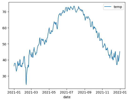
You are going to plot a line chart of temperatures by date. The original dataset contains many rows for a single date, and you wan to coalesce them with their median values.
noaa_surface_median_temps=noaa_surface[['date', 'temp']].groupby('date').median()
noaa_surface_median_temps.peek()
| temp | |
|---|---|
| date | |
| 2021-02-12 | 24.6 |
| 2021-02-11 | 25.9 |
| 2021-02-13 | 30.4 |
| 2021-02-14 | 32.1 |
| 2021-01-09 | 32.9 |
noaa_surface_median_temps.plot.line()
<Axes: xlabel='date'>
Area Chart#
In this example you will use the table that tracks the popularity of names in the USA.
usa_names = bpd.read_gbq("bigquery-public-data.usa_names.usa_1910_2013")
usa_names.peek()
| state | gender | year | name | number | |
|---|---|---|---|---|---|
| 0 | AL | F | 1910 | Sadie | 40 |
| 1 | AL | F | 1910 | Mary | 875 |
| 2 | AR | F | 1910 | Vera | 39 |
| 3 | AR | F | 1910 | Marie | 78 |
| 4 | AR | F | 1910 | Lucille | 66 |
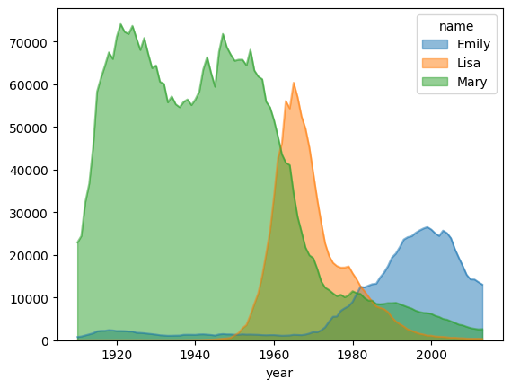
You want to visualize the trends of the popularities of three names in US history: Mary, Emily and Lisa.
name_counts = usa_names[usa_names['name'].isin(('Mary', 'Emily', 'Lisa'))].groupby(('year', 'name'))['number'].sum()
name_counts = name_counts.unstack(level=1).fillna(0)
name_counts.peek()
| name | Emily | Lisa | Mary |
|---|---|---|---|
| year | |||
| 1927 | 1631 | 0 | 70864 |
| 1918 | 2353 | 0 | 67492 |
| 1912 | 1126 | 0 | 32375 |
| 1923 | 2047 | 0 | 71799 |
| 1933 | 1036 | 0 | 55769 |
name_counts.plot.area(stacked=False, alpha=0.5)
<Axes: xlabel='year'>
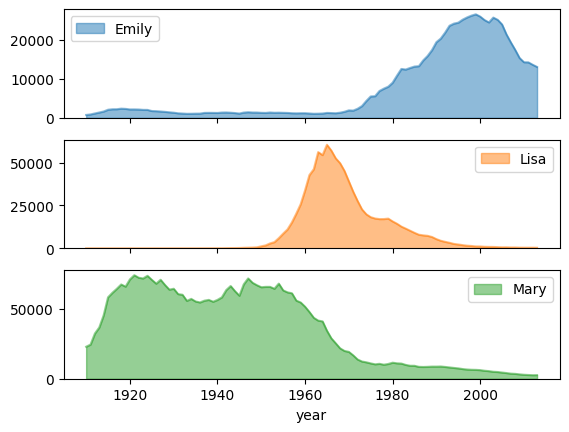
You can also use set subplots to True to draw separate graphs for each column.
name_counts.plot.area(subplots=True, alpha=0.5)
array([<Axes: xlabel='year'>, <Axes: xlabel='year'>,
       <Axes: xlabel='year'>], dtype=object)
Bar Chart#
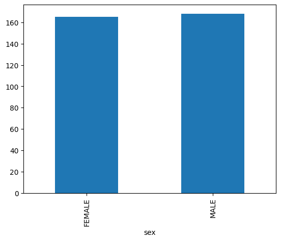
Bar Charts are suitable for analyzing categorical data. For example, you are going to check the sex distribution of the penguin data:
penguin_count_by_sex = penguins[penguins['sex'].isin(("MALE", "FEMALE"))].groupby('sex')['species'].count()
penguin_count_by_sex.plot.bar()
<Axes: xlabel='sex'>
Scatter Plot#
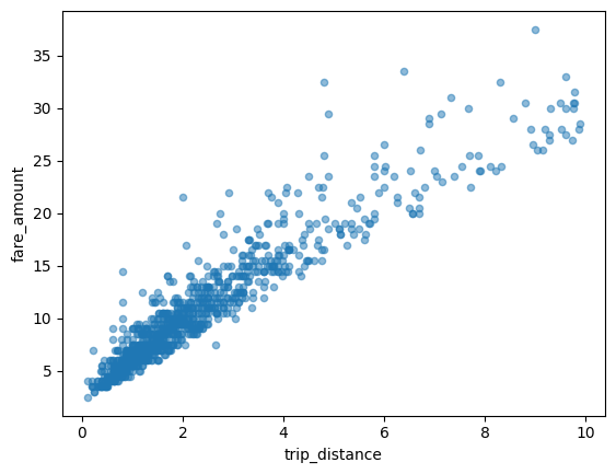
In this example, you will explore the relationship between NYC taxi fares and trip distances.
taxi_trips = bpd.read_gbq('bigquery-public-data.new_york_taxi_trips.tlc_yellow_trips_2021').dropna()
taxi_trips.peek()
| vendor_id | pickup_datetime | dropoff_datetime | passenger_count | trip_distance | rate_code | store_and_fwd_flag | payment_type | fare_amount | extra | mta_tax | tip_amount | tolls_amount | imp_surcharge | airport_fee | total_amount | pickup_location_id | dropoff_location_id | data_file_year | data_file_month | |
|---|---|---|---|---|---|---|---|---|---|---|---|---|---|---|---|---|---|---|---|---|
| 0 | 2 | 2021-09-19 10:25:05+00:00 | 2021-09-19 10:25:10+00:00 | 1 | 0E-9 | 1.0 | N | 1 | 0E-9 | 0E-9 | 0E-9 | 0E-9 | 0E-9 | 0E-9 | 0E-9 | 0E-9 | 264 | 264 | 2021 | 9 |
| 1 | 2 | 2021-09-20 14:53:02+00:00 | 2021-09-20 14:53:23+00:00 | 1 | 0E-9 | 1.0 | N | 1 | 0E-9 | 0E-9 | 0E-9 | 0E-9 | 0E-9 | 0E-9 | 0E-9 | 0E-9 | 193 | 193 | 2021 | 9 |
| 2 | 1 | 2021-09-14 12:01:02+00:00 | 2021-09-14 12:07:19+00:00 | 1 | 0E-9 | 1.0 | N | 1 | 0E-9 | 0E-9 | 0E-9 | 0E-9 | 0E-9 | 0E-9 | 0E-9 | 0E-9 | 170 | 170 | 2021 | 9 |
| 3 | 2 | 2021-09-12 10:40:32+00:00 | 2021-09-12 10:41:26+00:00 | 1 | 0E-9 | 1.0 | N | 1 | 0E-9 | 0E-9 | 0E-9 | 0E-9 | 0E-9 | 0E-9 | 0E-9 | 0E-9 | 193 | 193 | 2021 | 9 |
| 4 | 1 | 2021-09-25 11:57:21+00:00 | 2021-09-25 11:58:32+00:00 | 1 | 0E-9 | 1.0 | N | 1 | 0E-9 | 0E-9 | 0E-9 | 0E-9 | 0E-9 | 0E-9 | 0E-9 | 0E-9 | 95 | 95 | 2021 | 9 |
First, you santize the data a bit by remove outliers and pathological datapoints:
taxi_trips = taxi_trips[taxi_trips['trip_distance'].between(0, 10, inclusive='right')]
taxi_trips = taxi_trips[taxi_trips['fare_amount'].between(0, 50, inclusive='right')]
You also need to sort the data before plotting if you have turned on the partial ordering mode during the setup stage.
taxi_trips = taxi_trips.sort_values('pickup_datetime')
taxi_trips.plot.scatter(x='trip_distance', y='fare_amount', alpha=0.5)
<Axes: xlabel='trip_distance', ylabel='fare_amount'>
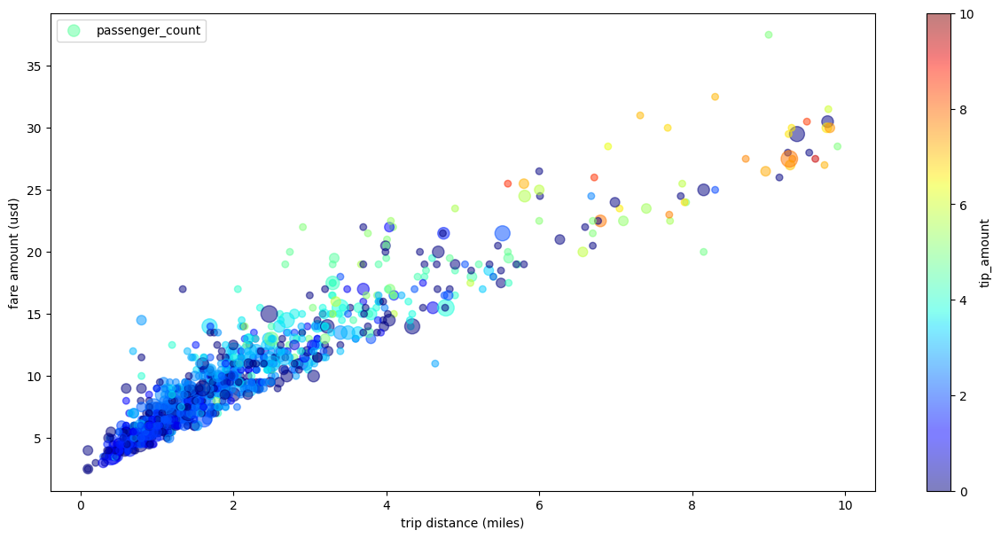
Advacned Plotting with Pandas/Matplotlib Parameters#
Because BigQuery DataFrame’s plotting library is powered by Matplotlib and Pandas, you are able to pass in more parameters to fine tune your graph like what you do with Pandas.
In the following example, you will resuse the taxi trips dataset, except that you will rename the labels for X-axis and Y-axis, use passenger_count for point sizes, color points with tip_amount, and resize the figure.
taxi_trips['passenger_count_scaled'] = taxi_trips['passenger_count'] * 30

taxi_trips.plot.scatter(
    x='trip_distance',
    xlabel='trip distance (miles)',
    y='fare_amount',
    ylabel ='fare amount (usd)',
    alpha=0.5,
    s='passenger_count_scaled',
    label='passenger_count',
    c='tip_amount',
    cmap='jet',
    colorbar=True,
    legend=True,
    figsize=(15,7),
    sampling_n=1000)
<Axes: xlabel='trip distance (miles)', ylabel='fare amount (usd)'>
Visualize Large Dataset#
BigQuery DataFrame downloads data to your local machine for visualization. The amount of datapoints to be downloaded is capped at 1000 by default. If the amount of datapoints exceeds the cap, BigQuery DataFrame will randomly sample the amount of datapoints equal to the cap.
You can override this cap by setting the sampling_n parameter when plotting graphs. For example:
noaa_surface_median_temps.plot.line(sampling_n=40)
<Axes: xlabel='date'>
Note: sampling_n has no effect on histograms. This is because BigQuery DataFrame bucketizes the data on the server side for histograms. If your amount of bins is very large, you may encounter a “Query too large” error instead.